Chris Cali Portfolio
Welcome to my personal portfolio website. Here, you can see content from my courses in the Data Analysis and Visualization Program.
Category Archives: Projects
An Exercise in Data Visualization: Personal Fitness Before & During the COVID-19 Pandemic
UPDATE: View my Tableau story here for a more visually stimulating experience of the project.
BELOW IS THE ORIGINAL ITERATION OF THE PROJECT FIRST PUBLISHED 11/7/21
Research Question
When the pandemic started, everyone had to make lifestyle adjustments. I wanted to create a picture of what my health and fitness looked like (and continues to look like) during the pandemic.
I take health and fitness very seriously and already acknowledge that I have been less active recently due to the pandemic. After all, I no longer have a daily commute where I am power-walking to and from the train stations or at the office consistently choosing the stairs over the elevator. Conversely, not having a commute has allowed me to be more consistent in my at-home weight lifting workouts.
I hope that my project will illuminate my current habits and motivate me to be more proactive in my fitness journey. How has my day-to-day activity changed in comparison to pre-pandemic levels? How has the transition from the gym to my home “gym” affected my lifting stats and exercises? What’s changed in my workouts?
Target Audience
The primary audience for this project is myself. Although I am sure the data will be most interesting and meaningful to me, Professor McSweeney opened my mind to the idea that many others could benefit from seeing this personal fitness project. Throughout the past year and a half, we have all taken part in a collective experience of unexpected change, increased fear, and disruption of daily routines. For those that are interested in their fitness and health and needed to make adjustments as I did, this project may appeal to you. I hope you can see similar experiences that can help you on your own fitness journey.
Plan for Analysis & Data Sources
I have split the data into two analysis groupings.
General Activity
First, I want to look at general activity. I have already pulled Google Fit data, which contains my daily steps, distance walked, and average speed over the past 6 years. 6 years is beyond the scope of this project, but I will use this data set to show differences in activity from pre-pandemic to during.
Weight Lifting Activity
For the second grouping, I will put together data sets from my notebook (pre-pandemic) and an image of my whiteboard in my apartment (during pandemic) that I used to track my weight lifting progress. I have the images of where I pulled the weightlifting data from and split them into two viewable albums (unfortunately, the Commons will not let me embed these albums, so I embedded in a post elsewhere) to show pre-pandemic and during the pandemic. 2 photos below show an example of how I kept track of my weight lifting. From these images, I have coded the information into an Excel file to create visualizations in Tableau. I have also made the decision to choose three exercises as coding the data is quite time-consuming.
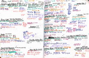
IMAGE 1 – Pre-Pandemic Tracking: I used a small notebook to track all of my exercises when I went to the gym throughout 2019 and the beginning of 2020. I used colors to correspond to dates and tracked weight, how many sets performed, and how many repetitions within those sets.
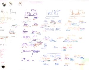
IMAGE 2 – During Pandemic Tracking: I used a whiteboard in my apartment to track the different exercises I did. I tracked the weight I used, how many sets I did, and how many repetitions of each exercise. Colors differentiate the days for which I did the specific exercises.
Visualization & Analysis
General Activity
See this visualization on Tableau Public.
From the line charts above, we can observe the following:
- There was a clear decrease in activity (measured in steps and distance) when the pandemic hit in March of 2020.
- March and April of 2020 were clearly the lowest months, which correspond to New York City’s worst outbreak. After those months, there was a rebound, but the average steps are still much lower than the same months in 2019.
- Day-to-day activity decreased during the pandemic.
Since I had historical data dating back to February of 2015, I wanted to quickly see the monthly averages and if the decrease in activity above could be accounted for by general shifts in the months. I thought that perhaps weather could also be a contributing factor to the differences in daily step averages. The chart below shows the average daily steps from each month over the 5 year span.
See this visualization on Tableau Public.
There do appear to be natural fluctuations in my steps, likely due to changes in weather. Even with this in mind, the numbers during the pandemic are lower than in the chart above.
Weight Lifting
Important Notes About Weightlifting Data Organization
In compiling the weightlifting data into the Excel Spreadsheet, I flagged a few things that viewers should take note of due to the imperfect method of tracking:
- The data set is not complete. There are missing workouts that I was unable to track and times where I decided not to log.
- The data set is not exact. During the pandemic, I failed to date all of the workouts, so I inputted them with approximate dates.
- There are three important measurements for each exercise: Sets (how many times the exercise was performed in the day), Reps (how many times the weight was lifted within a set), and Weight (how many pounds).
- Three exercises are highlighted. Coding the data became quite difficult and time-consuming, so I decided to take a look at three exercises over time: Incline Chest Press, Rows, and Shoulder Press.
- Up to 5 sets were coded for each exercise. A general rule of thumb I follow for each exercise is to complete 4 sets. There were occasions where I completed more. For simplicity, I coded the first and heaviest 5 sets. Those after are not tracked.
- Numbers for weight are the total for each lift. Some exercises could be performed with a barbell or dumbbells. For weight, I coded it as the total weight lifted for each rep. For example, if I used two 30 lb. dumbbells for shoulder press, I would encode 60 lbs.
With these limitations and specifics noted, we can move on to the important observations to be made from the data. See below for visualizations for each of the analyses. See here for the data set.
See this visualization on Tableau Public.
The scatterplot above charts the average weight lifted vs the average repetitions for each set and uses color to differentiate which are pre-pandemic exercises and which are during the pandemic. We can observe:
- During the pandemic, I did most of my exercises with a lot more repetitions.
- For pre-pandemic exercises, I was able to get the weight to be a bit higher.
- These observations make sense because before the start of the pandemic, I was going to a gym, where I had access to heavier weights. At home, I prioritized more reps instead of lifting heavier because I was limited by the equipment I had available.
I wonder, did I get stronger during the pandemic than I was previously? The following visualizations may be able to shed some light on that. One way to measure strength could be to sum the total weight lifted for each exercise. Below are the numbers for total weight lifted (that is, the weight multiplied by the amount of times it was lifted).
See this visualization on Tableau Public.
If strength is measured in how much I lift per exercise, you can certainly see that during the pandemic, my stats were much higher for amount of weight I lifted in all three of the exercises I chose to spotlight. With this said, I know from above that I performed more reps with weight that was slightly lighter, so I am not sure if this is a full picture of my weight lifting ability. Below, I break each exercise down further with the Average Weight that was lifted in each exercise and the Average Amount of Reps.
See this visualization on Tableau Public.
It appears that, with the exception of Shoulder Press, I was certainly lifting much heavier weight before the pandemic. During the pandemic and clear for all three exercises, the amount of reps I performed for each set of the exercises was much higher. None of my pre-pandemic rep averages is over 13, while it appears most sets during the pandemic exceeded that number. If strength is to be measured by how heavy one can lift, one could say that my pre-pandemic numbers are more successful.
Joining Step and Weight Lifting Data
Within Excel, I did a VLookup to fill in step data for all of the dates that I had a logged exercise. In the dashboard below, I have the dual axis charts for pre-pandemic and during the pandemic.
See this visualization on Tableau Public.
Here, we can observe that before the pandemic, steps were much higher than during the pandemic. Since it is a dual axis, the numbers are not on the same scale, but you can still observe that almost all days during the pandemic has the steps underneath the total lifted weight amounts, with the opposite taking place before the pandemic. This is consistent with the findings above.
Conclusion
It is clear that from my analysis, workout habits changed when the pandemic struck. Generally, I did not do as much walking, reflected in my step counts. When it came to weight lifting, I definitely made progress in the total amount of weight I was lifting during the pandemic, likely due to the amount of reps I was performing with the lighter weights. Before the pandemic, my general activity was much higher, but the pandemic allowed me to focus more on weight lifting at home. Shoulder Press is where I made the most important progress as my rep counts went up at around the same weight.
This project has illuminated to me that there are a lot of different ways to stay active. Though my routine changed during the pandemic, I was still able to stay active and healthy. The lesson here is that as ling as you stay active and stay aware of what you are doing with your body, you can maintain your health! Looking forward, I think I will make the goal to balance my weightlifting, so that I can increase the amount of weight I lift, but also maintain the higher number or reps that I complete.
Design Choices
Line Graphs: I wanted to keep the design very simple for both of these graphs. I focused on the tooltip to ensure that it was easy to view and had the relevant information.
Scatter Plot: I needed to use color to differentiate between pre-pandemic and during pandemic workouts as I did not include the dates or chronological order of the workouts.
Bar Graphs: I thought it would be most effective to have bar graphs on top of one another for easy comparison.
Bar & Line (Dot) Graphs: I chose this set up because I thought it would be important to see the differences in weight lifted and reps side by side. Going with a similar strategy to the other bar graphs, I stacked them on top of each other for easy viewing. I thought the findings there were striking and interesting.
Dual Axis: I thought it would be beneficial to see step data and weight lifting data side by side to really bring both of the analyses together.
In general, I tried to give color a lot of importance, but also made sure that the tooltips had all of the information that would be needed if color was not considered.
An Exploratory Analysis of 311 Calls Handled by the DSNY During the COVID-19 Pandemic
Research Question
For this first project, I put myself into the shoes of a DSNY (Department of Sanitation NY) data analyst. I would like to examine the 311 calls that DSNY handles and see if there are any specific types of complaints that need to be addressed, more so than others. In an initial filtering of the data, I think a good way to get the data simplified is to look at it in three ways: citizen issues, sanitation issues, and other issues that do not fit within either of the categories. To further clarify, citizen issues deals with problems that are caused by the average New Yorker – of illegal dumping, residents not cleaning up their garbage properly, etc. Sanitation issues refer to problems caused by the department itself – of complaints about workers, baskets not being picked up, etc. I wonder: As we continue into this new normal, which specific complaints can the DSNY focus on to decrease the amount of sanitation-related 311 calls the city receives and, more consequently, improve the quality of life of New Yorkers and performance of the agency? Additionally, how has the volume of DSNY-related 311 service requests changed throughout the pandemic?
Each of the complaint types were coded the following way:
Citizen Issues |
Sanitation Issues |
Other |
| Abandoned Bike | Collection Truck Noise |
Litter Basket / Request
|
| Derelict Bicycle | DSNY Spillage |
Other Enforcement
|
| Derelict Vehicle | Employee Behavior |
Sanitation Condition
|
| Dirty Conditions | Missed Collection | Snow |
| Graffiti | Missed Collection (All Materials) |
Vacant Lot
|
|
Recycling Enforcement
|
Overflowing Litter Baskets | |
| Snow Removal | ||
| Sweeping/Inadequate | ||
| Sweeping/Missed |
The 311 Service Requests were sorted through and pulled from NYC Open Data. Since analysis is for the time period of the pandemic, data was pulled from March 11, 2020 (my first day of working from home) through August of 2021.
Target Audience
City officials, specifically in the DSNY, but also beyond at City Hall, would be interested in seeing the answer to the research questions above. Having this information would be beneficial to these stakeholders because it can influence where departmental resources are distributed for more efficient use of the DSNY workforce. Additionally, this information can determine if there is any legislation that can be passed to improve conditions for New Yorkers.
Initial Analysis & Visualization
Issue Types
To begin I created a stacked bar chart to demonstrate which types of issues are reported most frequently and further, to show which complaint types are most common in each. I chose to do a stacked bar chart because it allows us to see both of these measures in one chart.
In reviewing the stacked bar chart above, we can observe the following:
- While both DSNY-related issue types are common (with over 70,000 reports each) for both Citizen & Sanitation Issues, 311 callers more frequently complain about issues caused by other average New Yorkers, not the sanitation department itself.
- Within Sanitation Issues, Missed Collection is by far the most frequent complaint type with almost 70,000 reports.
- Within Citizen Issues, Dirty Conditions and Derelict Vehicles are most frequently reported, both at over 50,000 reports.
Design choices for stacked bar chart:
I tried to keep this chart simple, as to communicate clearly. I coded each of the issue types with different colors and then made a gradient for each of the complaint types. We primarily look at the quantities here, so I made sure the tooltip only contained the important information – the complaint type and quantity.
Monthly Trends During the Pandemic
Below, we see how DSNY-related 311 service request volume has changed throughout the pandemic. It is important to note that for all graphs below, we used the date that the report was created, which would correspond to the day that the call was initially made.
I also broke these out into the different issue-type categories to see if there was anything to glean from those differences.
We can observe the following:
- The lowest volume of 311 complaint calls happened in the earlier months of the pandemic. This seems to loosely line up with NYC lockdown in early 2020 and gradual reopening over time. Vaccines started becoming available to select adults in January, but ramped up in March and April. Perhaps there is a slight correlation between the vaccine rollout and 311 calls as well.
- The months with higher 311 service requests appear to be consistent across issue types. We cannot observe that any specific month had significant differences based on issue type on a month-to-month basis.
- March of 2021 has the highest call volume.
Analysis of Missed Collection, Dirty Conditions, and Derelict Vehicles
I am most interested in doing further analysis on the Missed Collection, Dirty Conditions, and Derelict Vehicle complaint types as those are the most common 311 reports to the DSNY. Further analysis of these complaint types can provide information to resolve the most frequent complaints from both issue categories.
We can observe from the line graph above:
- Consistent with earlier graphs, March of 2021 saw the most requests in the three complaint types I am focusing on: Missed Collection, Dirty Conditions, & Derelict Vehicles.
- Missed Collection had a stronger spike – perhaps this is weather related and can be resolved by ensuring more sanitation staff are available to work overtime to address issues of snow and garbage collection.
- Opportunity for further analysis: Does snow have anything to do with this and perhaps the higher winter call volumes in general? We can look at the relationship between weather patterns for those months and the ticket volume. Additionally, we can compare this to calls that are snow-related.
Design Choices for Line Graphs: I decided to make the line graphs very simple and thought that it was more beneficial to split the categories and complaint types into different graphs to make it more easy to view.
Call Completion/Resolution
I had initially tried to do these charts as a bar graph or pie chart. Both were quite ineffective and unnecessary, so I decided to go with a table. We can observe that in all of these categories, most of the tickets are closed.
Opportunities for further analysis:
- Since we used the date that the service requests were created, in other words that the call was made, it would be interesting to see the time elapsed to when they were closed/resolved. This can further illuminate where department resources should be focused.
- Reviewing the descriptors to see what types of responses each of the issues received. One example of a Derelict Vehicle I noticed was that it was not actually a Derelict Vehicle – no further action was required after that.
- Mapping where open/pending cases are.
Conclusion
There are many interesting things to be gleaned from looking at the DSNY 311 Data. It is fair to conclude that both Citizen and Sanitation issues are of big concern and that the Missed Collection, Dirty Conditions, and Derelict Vehicle complaint types are the most common. It would be fair to suggest that DSNY officials take a closer look at these specific complaint types to try and decrease the amount of calls they get in those categories.
Interestingly, it appears that the Winter months of 2021 got the highest volume of 311 complaint calls with another spike happening in the warmer months of 2020.
With this, there are definitely more questions and further analysis to be done.